Counting matters. As the Stiglitz-Sen-Fitoussi report puts it:
What we measure affects what we do; and if our measurements are flawed, decisions may be distorted…. [I]f metrics of performance are flawed, so too may be inferences we draw.
The UN Secretary General was told two years ago by the 2012–13 High Level Panel of Eminent Persons on the Post-2015 Development Agenda that any follow-up to the Millennium Development Goals (MDGs) had to include a data revolution.
In common with the UN global thematic consultation on inequality earlier in 2013, the High Level Panel recognised that challenging inequalities and better data collection are inextricably linked – because better data make it clear which goals are and are not being met, and because with better data we can all demand answers and action.
So the data revolution can only be about changing the balance of power. Yet much of the current discussion emphasises purely technical reforms instead.
I use the term ‘Uncounted’ to describe a politically motivated failure to count that reflects power. It ignores people and groups at the bottom of distributions whose ‘uncounting’ adds another level to their marginalisation. It ignores people at the top whose uncounting hands them even greater power.
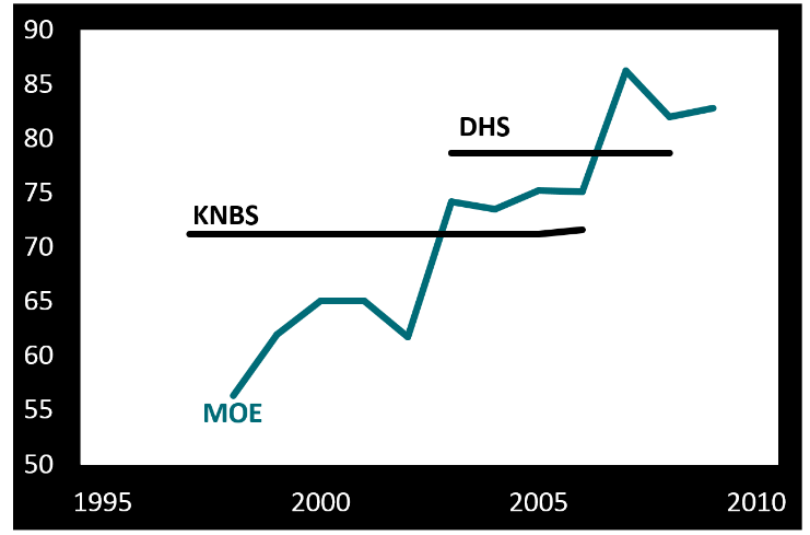
Why do we fail to count well at the bottom? This figure shows three different series for primary school enrolment in Kenya. One comes from the Kenyan National Bureau of Statistics (KNBS); one from the Demographic and Household Surveys (DHS); and one from the Ministry of Education (MOE). MOE data come directly from schools and are used as the basis for funding decisions.
Now, MOE trends tell you that progress is rapid and unsustained, while surveys look static. Which do you believe? If your children are in Kenyan state education, how well counted do you feel?
Not that survey data are perfect either. Six groups are systematically excluded from most household survey and census returns. Excluded by design are the homeless, those in institutions and nomadic populations. Ignored by undersampling are those living in fragile, disjointed households, in areas facing security risks and in informal settlements. These groups, thought to amount to around 250 million uncounted people – roughly 3.5% of today’s global population – obviously contain a disproportionate share of the world’s poorest people. They are being systematically failed even in the ‘best’ counting approaches we have.
It’s no coincidence that people in poverty are excluded. Nor is it because of technical problems that Sudan’s government in Khartoum suppresses publication of data on regional development outcomes. Or that the deaths of those living with disabilities in the UK go uncounted.
As for counting at the top, it’s equally no coincidence that high-income households are undersampled in surveys. Or that even when tax data are used to adjust the picture, major wealth – $8 trillion? $32 trillion? – remains uncounted. Or that the OECD, charged with measuring the ‘misalignment’ globally between the profits of multinational companies and the actual location of their economic activity, has so far been unable to lay its hands on the necessary data.
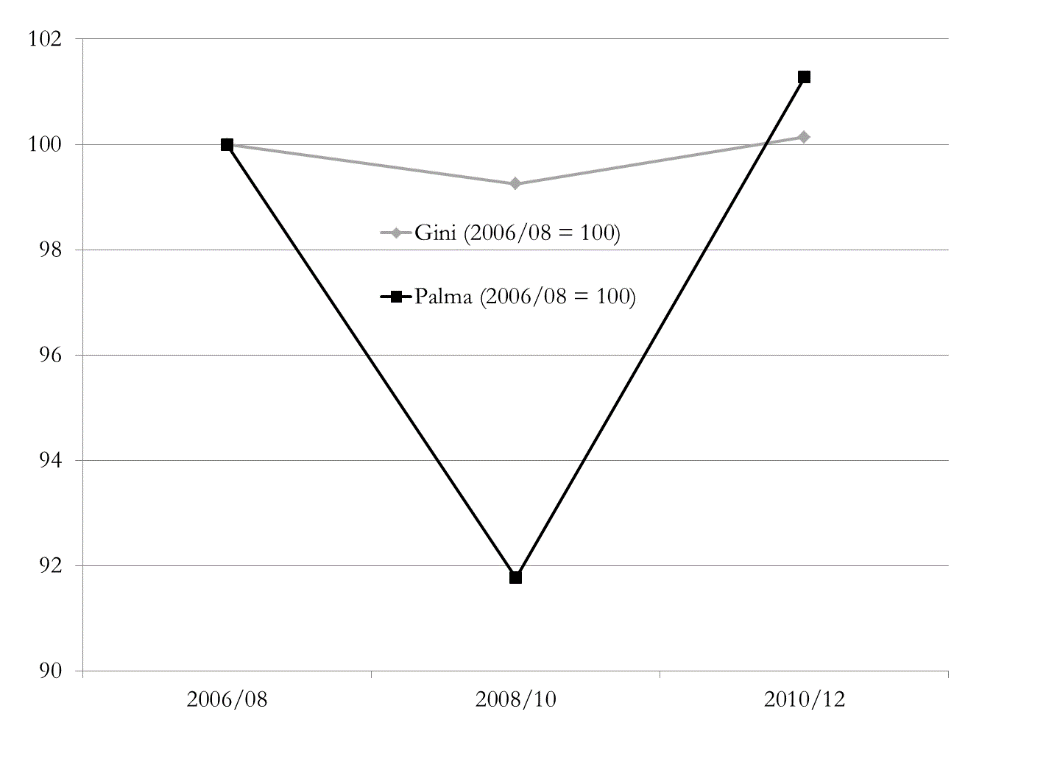
Our choice of measure is also important – and also political. Take a look at this chart which shows how two measures, the Gini coefficient and the Palma ratio, come up with radically different answers to the same question about income distribution. Has UK wealth inequality been flat across the crisis? Or did it fall sharply, then immediately rebound even more dramatically?
The Gini coefficient embodies such strong normative views (pp. 129–144) that it doesn’t capture well changes in the top 10%, or in the bottom 40% where most poverty lies. It is very encouraging (to me!) that instead the Palma ratio has featured in recent drafts of the post-2015 indicators.
The Palma – which expresses the ratio of income shares of the top 10% to the bottom 40% – also embodies a normative view, but it’s absolutely explicit about it. The chart of UK wealth distribution across the financial crisis shows why the Gini gave rise to so many congratulatory headlines about stable inequality, and why they’re wrong.
What might an actual ‘data revolution’ look like? If there’s no recognition of the political nature of the problem, then we’d be fooling ourselves to expect any great change: the same people and the same things will continue to go uncounted.
What’s noticeable in the discussion so far is that there has been a great deal more attention paid to the uncounted at the bottom than at the top. There’s been precious little mention of Piketty’s proposal for a global wealth register, for instance, or of specific measures that would eliminate anonymous company ownership, require states to exchange tax information with each other (think SwissLeaks), or multinational companies to publish country-by-country reporting (think LuxLeaks). Yet if we don’t start counting things that make elites uncomfortable, then we’re not doing it right.
Data reforms are, broadly, welcome; but a revolution remains far off. People and things go uncounted largely for political, not technical reasons.
That’s why a data revolution is so badly needed. And revolutions aren’t technical: they’re political.


